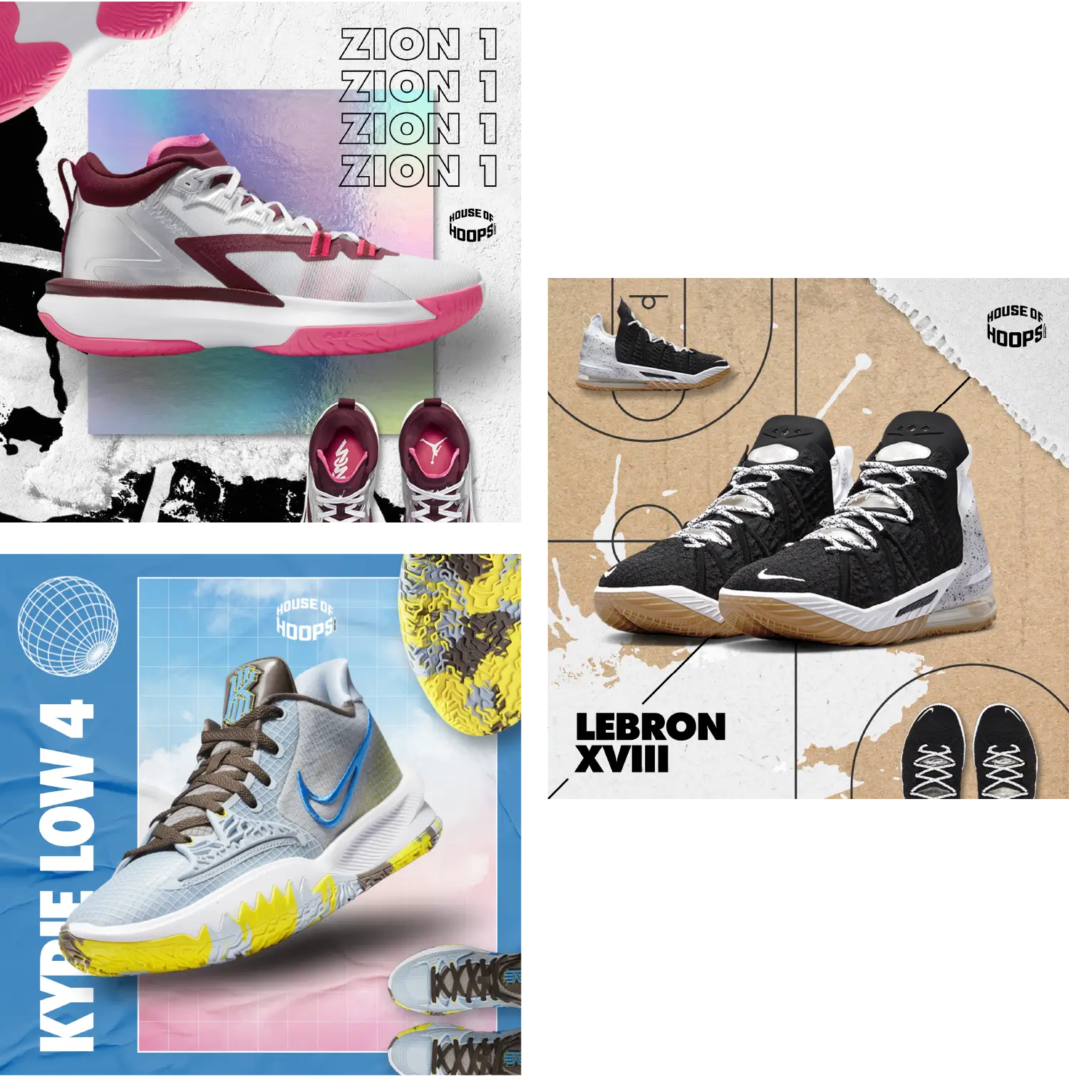
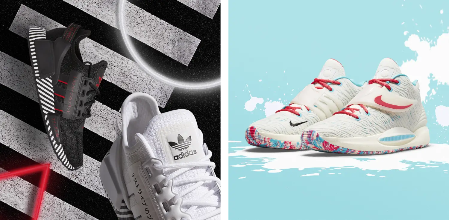
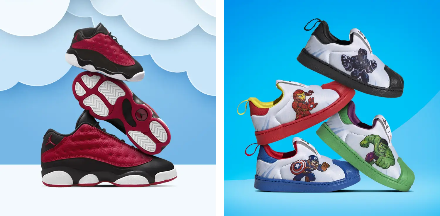
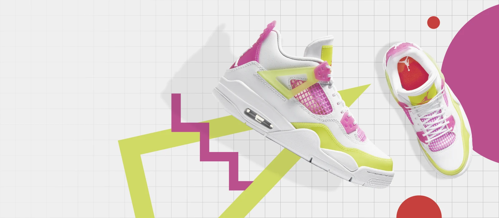
Sneaker creative
At Foot Locker, I designed landing pages, emails, and web graphics across the organization’s six banners (Foot Locker, Foot Locker Women, Kids Foot Locker, Champs Sports, Footaction, and FLX) by leveraging creative from the biggest names in shoes and apparel.
The best part of this job was the blank canvas. Often my brief was simply the name of the shoe, a few photos from various angles, and the copy that was to be paired with the asset. The rest was up to me and my imagination, which is rare at a company that size.
It probably won't be long before this type of work is heavily automated by AI, so I'm glad I got to sharpen my Photoshop skills here before that world existed.
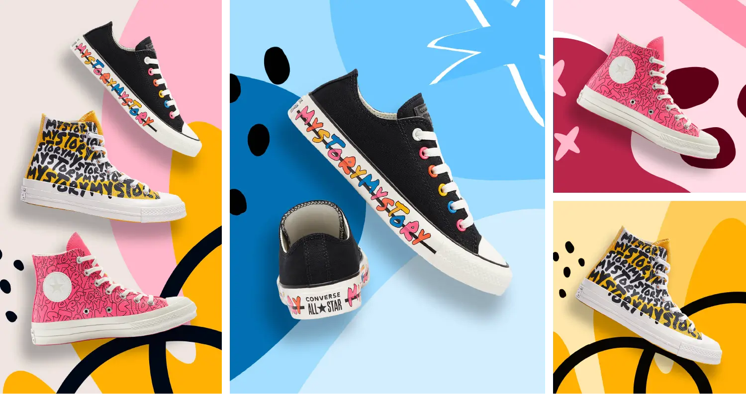
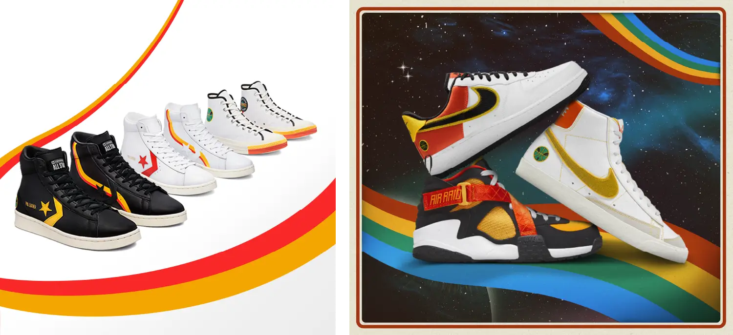
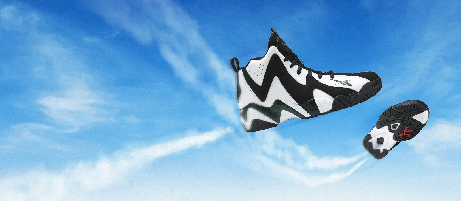
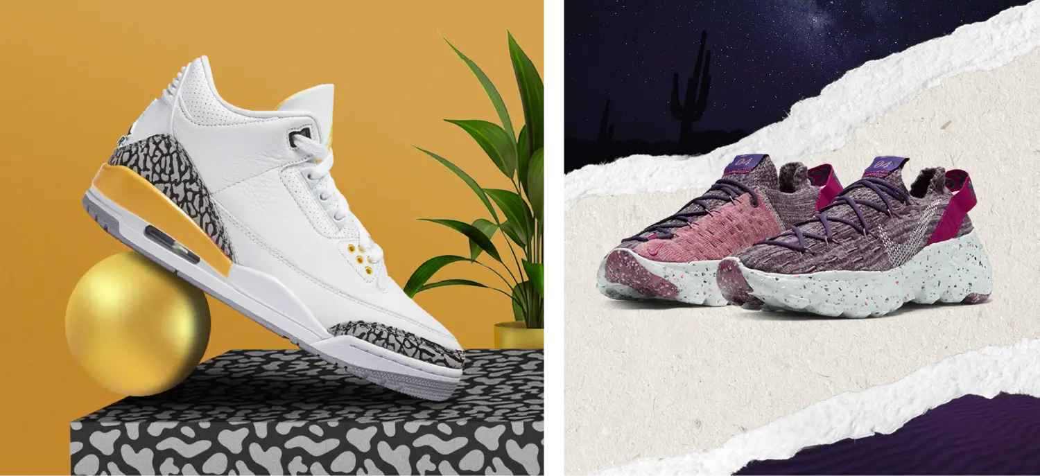
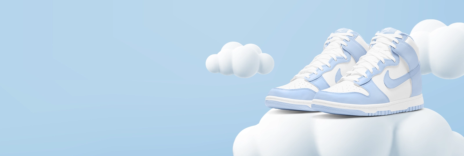
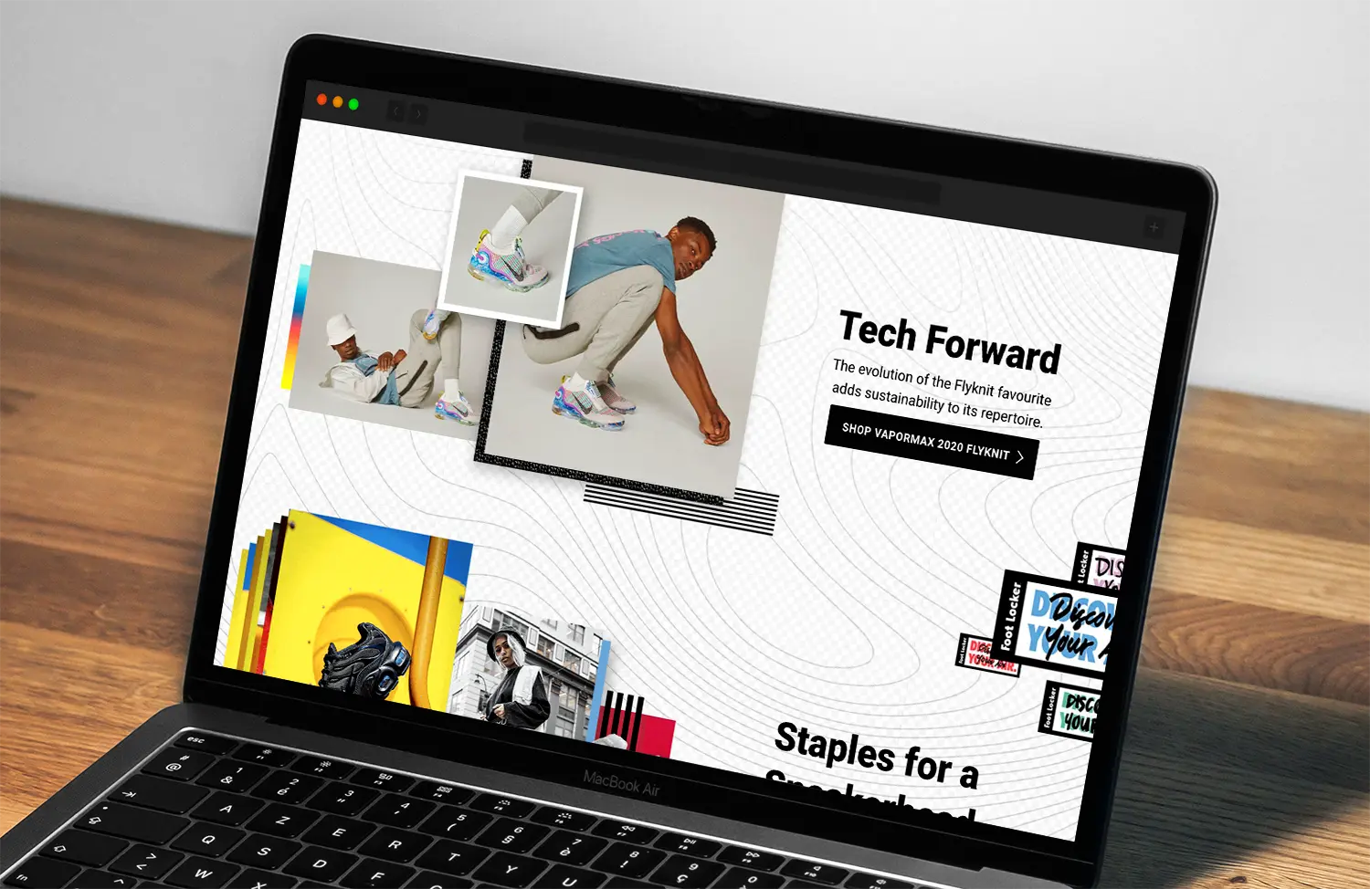
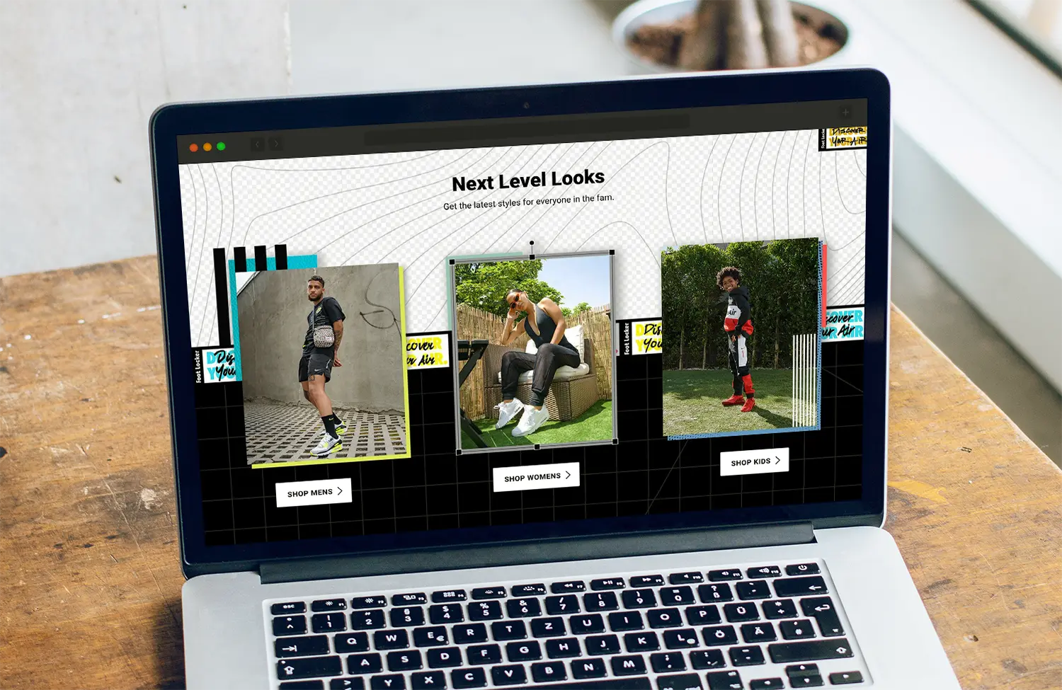
Landing page creative
I designed landing pages for the Foot Locker website using Adobe Experience Manager (AEM) and Photoshop. We used a proprietary build of AEM created by Foot Locker's in-house UI/UX team which made getting a webpage live easy, but created some unique challenges when it came to creating interesting, complex designs that could function on both desktop and mobile.
In this example, I leveraged a style guide created for the Discover Your Air campaign. This was an ideal project for me because while some of the specifics assets like our photography, colors, and the DYA "stickers" were provided, all the remaining assets needed to be created from scratch. This gave me a lot of creative freedom, but also gave me some helpful guardrails and a place to start.
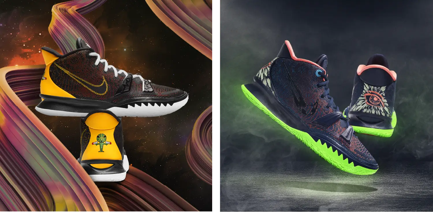
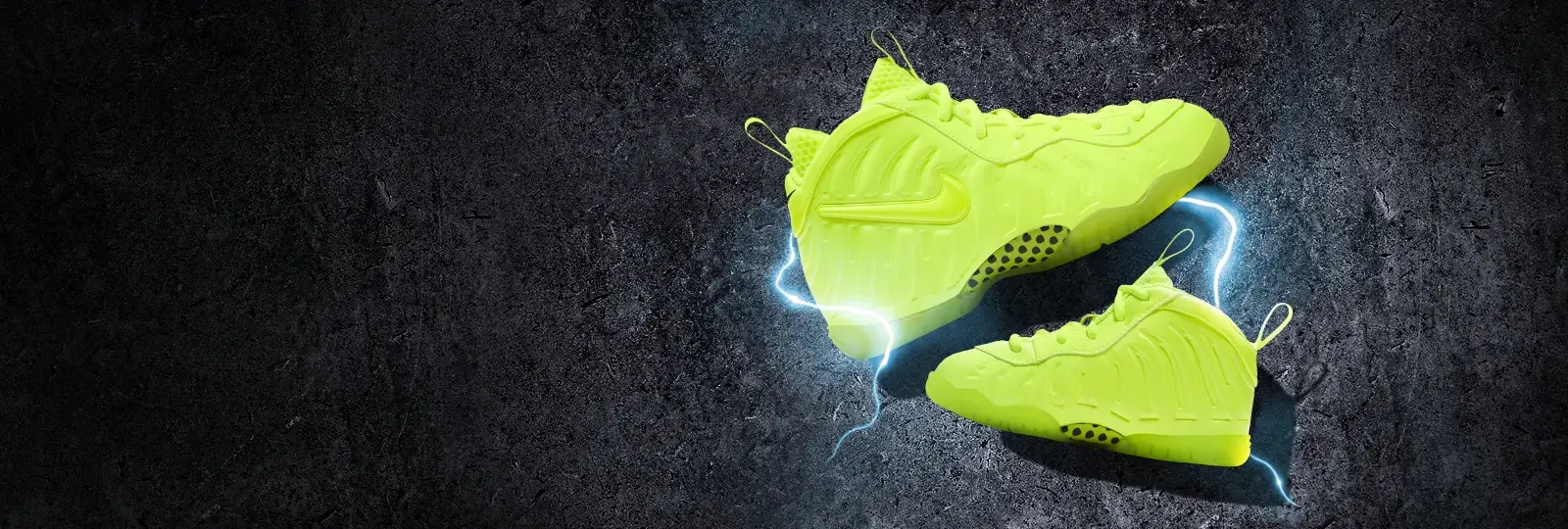
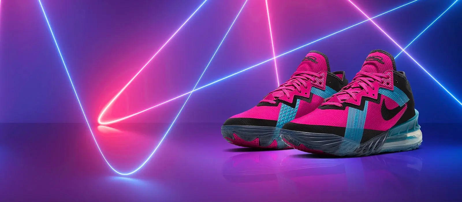
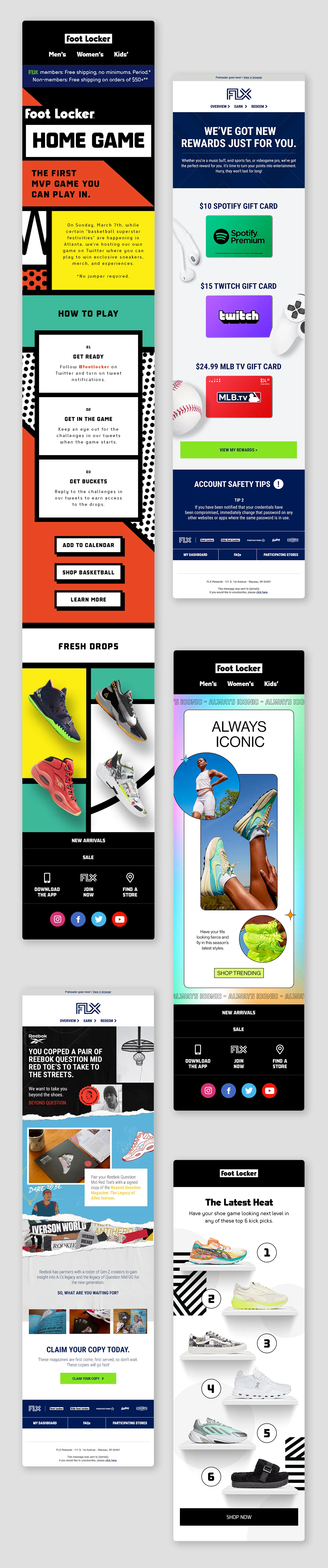
Email creative
My team was also responsible for the design of all of Foot Locker's marketing emails. We templatized a lot of our email output in order to keep up with our fast-paced release schedule, but often I'd find opportunities to create custom designs when the project called for it.
Images courtesy of Foot Locker, Inc.